Journal of Financial Planning; July 2011
Joe Taylor is the founder and president of Oak Street Advisors in Myrtle Beach, South Carolina. He is a fee-only adviser and member of NAPFA.
Executive Summary
- This paper seeks to illuminate how bond returns vary as a bond moves through time.
- It also shows how to develop a price curve from the data points implied in the yield curve.
- The author analyzes the effect of coupon rates on bond returns in varying interest rate environments.
- The purpose is to provide information to make better fixed-income investment decisions:
-Visualize and model expected price behavior of bonds under varying interest rate scenarios.
-Aid in selecting securities with coupons and maturities to maximize returns in changing interest rate environments. - The author graphically represents this information for client teaching purposes and better understanding for planners of all experience levels.
- A spreadsheet workbook is available online for advisers to download and adapt to their own practices; Please click here.
For many years the selection of individual bonds for investment portfolios entailed credit quality analysis, current yield, yield to maturity, maturity date, and our clients’ need for cash flow or return of principal. Over the past decade (with the notable exception of the credit crunch in 2008) progressively lower interest rates created a bull market for bonds in which it was hard to be wrong if you held the strongest credit qualities. Yet with rates on the federal funds currently at almost zero we know it is just a matter of time before building bond portfolios becomes much harder. Rising interest rates bring the double trouble of lowering the value of bonds and perhaps also lowering returns on equities. This could lead to a positive correlation of bonds and stocks similar to the one that decimated so many portfolios a couple of years ago. With that in mind, perhaps now is a good time to visualize bonds from a new perspective.
My goal in this article is to illustrate how looking at bonds from a new angle—incorporating the dimension of time into your analysis, selecting the appropriate maturities for a rising or falling interest rate environment, and selecting bonds with coupons that match your expected interest rate projections—can help you build better fixed-income portfolios for your clients in these changing times. I will also share with you a new tool to add to your existing arsenal for making this analysis quicker and easier, and explain how you can build your own analytic tool.
A Fresh Look at an Old Chart: The Yield Curve
We are all used to looking at bond yields in the form of the ubiquitous yield curve. We see it every day and take for granted the wealth of information embedded in this one simple graph. Even though it is an old tool, we use it daily to make decisions about bond investments, and we watch its movement over time, factoring changes into our expectations of equity market performance as well. The yield curve simply tells us what returns are required by investors for bonds with varying maturities.
Looking at the yield curve from a purely bond investment perspective, if we expect interest rates to remain static we should be purchasing bonds at the point where the slope of the yield curve is steepest, as this represents the area with the best total return characteristics. This is because of the inverse relationship between interest rates and bond prices. The point where the yield curve is the steepest is the point where interest rate expectations are falling the fastest and, therefore, bond prices are rising the fastest. But this is a “skating to where the puck is” strategy. While the yield curve is an easy starting point for selecting bond maturities in a static rate environment, it is of little value in selecting varying coupons or visualizing how shifts in the curve will affect the price of a particular security.
Figure 1 shows how an increase or decrease in interest rates causes a shift in the yield curve. We know that if rates fall along the curve, our bond investments will rise in value, and we know if rates rise along the curve, bond prices will fall. It is unlikely, however, for interest rates to shift evenly along the yield curve. Sometimes the short end of the curve rises or falls more than the long end of the curve, and sometimes the long end changes more than the short end. Many factors go into the morphing shape of the yield curve just as many factors go into the price movement of a particular bond. But by looking at a forecast of a future yield curve we can at least attempt to “skate to where the puck will be.”
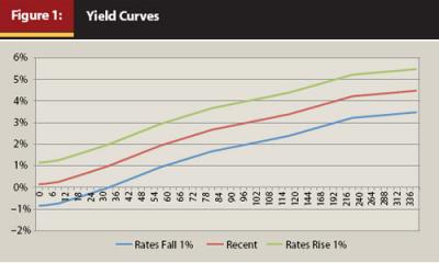
For securities other than U.S. Treasuries, credit quality is also factored into the shape and slope of the yield curve for that group of securities. When considering bonds, it is important to make an apples-to-apples comparison. For example, the yield curve for AAA-rated bonds will be different than the yield curve for BBB-rated bonds, and the yield curve for Treasuries will be different from the yield curve for municipals. Credit risk shifts the yield curve for bonds in much the same way as a change in interest rates does. If the perceived credit risk increases, the yield curve for that security will shift to a higher level—similar to when interest rates rise—as investors rightly demand more return for taking on more risk. If the credit risk of a security is perceived to be lower, the yield curve will shift to a lower position as investors bid up the price of the security to reflect their new confidence in the return of their principal.
The Seesaw
It is worth remembering that bonds behave like a seesaw. If interest rates rise, the price of a bond will fall. If interest rates fall the price of a bond will rise. And as with a seesaw, the further out you are from the fulcrum (the longer the maturity) the bigger the swings or volatility. Also as kids on the playground all learn, the weight on one end of the seesaw, or the coupon of the bond, makes a big difference in how hard it is to get the seesaw to move, or the price of the bond to vary.
Total Return
Many of us look at bonds as merely a way to manage risk in a diversified portfolio or provide cash flow to fund the spending needs of clients. But current tax laws encourage a total-return strategy. The spread between taxes on ordinary income (interest payments) and long-term capital gains (price appreciation) is significant. In 2011 the maximum tax rate for long-term capital gains is 15 percent compared to up to 35 percent for ordinary income. For taxable investors, capital gains generate more after tax income than a like amount of interest income, so it only makes sense to invest that way. Additionally, in an environment of rising interest rates, the decline in bond values could potentially exacerbate negative moves from the equity markets, as bond prices fall faster than coupon payments accrue. But by using a total-return strategy, it may be possible to reverse that outcome so that coupon income accrues faster than the price of the bond falls.
The Time Factor
Investors tend to think of bonds in only two dimensions: the number of years remaining until maturity and the yield to maturity. When I ask someone what the return will be on a 10-year bond with a yield to maturity of 3.38 percent over the next 12 months, the likely answer will be 3.38 percent. That is almost certainly the wrong answer. The 3.38 percent yield to maturity quoted represents an average annual compound rate of return on the bond if held to maturity. The actual return on this bond over a 12-month span is unknown, but if we expect interest rates to remain steady or fall, the answer is likely to be a number greater than 3.38 percent. In fact it is highly unlikely that the 12-month return on this bond is ever 3.38 percent. As we own a bond, its returns vary constantly in relation to changes in interest rates and perhaps in relation to changes in perceived credit risk.
But more importantly, the return changes as the bond “ripens” or approaches final maturity. To maximize total returns on fixed-income investments, it is important to add a third dimension of time to our bond analysis. If you purchase a 1-year bond, then one year from now you have cash back in your hand and have reached the fulcrum of the seesaw. If you buy a 10-year bond, then next year you will own a 9-year bond, and the year after that an 8-year bond, etc. Each year your bond moves incrementally closer to the fulcrum with the resulting lower interest rate expectation and lower volatility and shorter duration. Thinking about bonds as they move through time opens new opportunities for profits. Rather than purchasing a bond with two years until maturity, there may be times when it is prudent to purchase a bond with several years until maturity, and liquidate the security when the need for principal arises.
The Price Curve
When the yield curve is in a normal state, shorter-term interest rates are lower than longer-term interest rates. From a risk standpoint, this makes sense. The closer to maturity, the less risk from default, the less risk from inflation, the less risk from events. The lower the risk, the lower the return. Because interest rate expectations fall as a security reaches maturity and bond prices move inversely to interest rates, that also means that the price of that security should rise as the bond nears maturity. A 30-year bond issued at $1,000 should appreciate gradually as it gets closer and closer to maturity (provided interest rates remain stable), but because the bond will eventually mature and return the original principal amount, it is evident that at some point the same bond will gradually decrease in price until it ends its life at the same $1,000 at which it began. So initially, a new-issue bond will appreciate gradually in price as it ages, and interest rate expectations for the resulting shorter maturity will fall, but because the bond is always anchored by its final maturity, the price must at some point fall until the bond once again is valued at par. Hence the price curve.
Using a spreadsheet, I developed a way to look at the potential returns of a security across time and through projected changes in the yield curve. The results give us graphical representation of how the price of a particular security can be expected to change throughout its life. This tool allows for modeling the expected price of a given security through any number of interest rate scenarios. It allows for identification of which maturities are likely to fare best under varying interest rate conditions as well as comparison of the potential performance of similar securities with different coupons.
Constructing the Price Curve
For a given security, the expected price is implied by the yield curve and can be calculated from information embedded in the yield curve. Unlike equities, in which cash flows and future values are unknown, the value of a bond is simple to calculate as the present value of future cash flows—all of which are fixed numbers and require no guesswork to determine. A bond’s value is simply a series of calculations of the present value of a flow of payments.
PV = pmt[1 – (1/(1 + i)n/i] + FV/(1 + i)n
Using just a little technology, you can develop a spreadsheet to mimic the math in a much more user-friendly fashion comprehensible to planners and clients. All you have to do is insert the formula into the correct cell. I have made a copy of the spreadsheet used to calculate the price curve using Google Docs available, linked here. One of the limitations of Google Docs is you cannot protect individual cells, so the entire spreadsheet is protected to maintain its integrity. You can download the spreadsheet to your local computer and copy it to another spreadsheet that you can manipulate for your own use, or you can view the formulae I have used and adapt them for your own needs.
To develop a price curve for a given security, we simply treat each point along the curve as a present value calculation based on interest rates, coupon, time remaining until maturity (or call date), and value at maturity. For each period we wish to examine the present value calculation as a function of the expected interest rate, time until maturity, number of payments, and amount of the payments, such that:
i = 30-year rate (then 29-year rate, 28-year, etc.)
pmt = coupon/2
n = years to maturity 5 2
FV = maturity value
Keep in mind that the expected rate of interest changes for each period. For example, the present value of a bond with a coupon of 5.5 percent with 240 months until maturity—in which the yield curve tells us a 20-year bond yields 4.22 percent—is $1,171.89. If the yield curve tells us that a bond with 19 years until maturity should yield 4.14 percent, we can expect this bond to be worth $1,178.41 next year. When we combine the coupon of $55 per bond with the expected price increase of $6.52, we have an expected total return of $61.52, or 5.25 percent on our original investment. This is significantly higher than the yield curve viewed in only two dimensions would lead us to expect.1
It is impractical to manually calculate all the possible values of this bond over a 20-year span, but by developing a spreadsheet to do the heavy lifting for us, we can vary our inputs and create useful data and graphs with just a few entries. The resulting price curve can be graphed to give us a picture of how we might expect the value of a given security to fluctuate throughout its lifetime. It is an effective modeling tool that can help us as advisers to select securities that more closely meet the needs of clients for safety, cash flow, and volatility.
Figure 2 represents the expected price movement through time of a 30-year U.S. Treasury bond if interest rates remain static. The coupon for the bond is set to match the yield available for a 30-year bond with a recent yield curve. The rates of 3-month, 6-month, 12-month, 3-year, 5-year, 10-year, 20-year, and 30-year bonds were used to build the curve. Values for dates between these benchmark yields were derived through simple extrapolation.
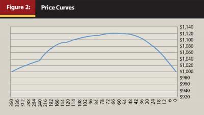
In Figure 2 the security begins and ends life at par $1,000, but because the security naturally morphs each year into a shorter maturity with a correspondingly lower interest rate expectation, the price rises, gradually peaking at about the 5.5-year mark. From there the value declines over time until at maturity it must be valued at $1,000. Like the yield curve, the price curve of a given security will change based on changing interest rates, and the price curve will be slightly different for each different coupon rate.
What Happens When Rates Change?
With federal funds rates currently set near zero, there is arguably only one direction for interest rates to move—up. So while the price curve can help us no matter what interest rate scenarios we envision, I am focusing most of this discussion on a rising rate environment. I believe it is the most likely scenario over the next few years and the most challenging to deal with. The key to implementing a total-return strategy in a rising interest rate environment is to successfully identify which securities in terms of credit quality, maturity, and coupon will provide the best return, or at least the least-worst return, through the rising rate cycle.
Using the example of the 20-year bond with a 5.5 percent coupon, let’s examine what happens to the price if interest rates rise. If in one year the expected yield for the 19-years-to-maturity bond we own jumps from 4.14 percent to 5.14 percent, the new present value calculation tells us we can expect the price of this bond to drop to $1,043.34—a loss of $128.55 in principal value. Even with adding in the coupon income of $55 we have experienced a loss of $73.55, or 6.27 percent. If interest rates fell so that our 19-year bond should be yielding 3.14 percent, the present value calculation tells us our bond should be worth $1,335.78, giving us a capital gain of $169.89. This puts a face on the rule that the longer the maturity, the bigger the price swing of a bond.
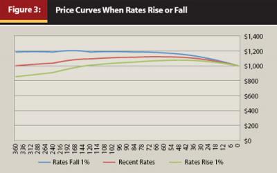
Figure 3 shows a shift in the price curve of a bond correlated with a shift in the yield curve of +1 percent and –1 percent, as depicted in Figure 1. When interest rates change, the price rises or falls most at the longer maturities, but always converges at maturity or terminal value.
Price curve analysis can also be useful when we select an alternative interest rate scenario. Let’s look at the current yield curve and a possible alternative scenario. Here I have selected an alternate interest rate scenario where long rates rise more than short rates, but rates do rise across the board. The yield curves in Figure 4 show the before and after snapshots of interest rate requirements at varying months to maturity.
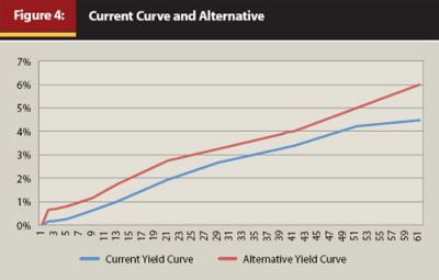
The slope of the two alternatives is dramatically altered. What will this mean to the price curve of the same security? Obviously, the price will fall across the time spectrum. But more importantly for a bond investor, will it fall so far that one should avoid this investment altogether, or is there an area on the yield curve that will still manage to have a positive total return?
By modeling the price curve of the bond under both interest rate scenarios in Figure 5, we can easily visualize how the price will shift along the yield curve. Using a bond with a coupon of 4.478 percent, chosen because it matches the 30-year yield of a recent U.S. Treasury bond, we see the value of the bond is eroded across nearly the whole length of its life. As expected, when rates rise, the price of the security falls. Yet the price will eventually converge to par at maturity.
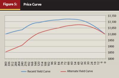
At first blush you would want to avoid this security if you believed the alternative rate projection was likely. But looking at the underlying data and doing some further analysis, we can find an area on the price curve that still provides positive total returns and thus reposition client holdings to protect principal. If we look closely, the price curve can help us find a way to show a positive total return even as interest rates rise.
Calculating the present value of our 4.478 percent coupon bond under the recent yield curve for a maturity of 84 months, our cost to purchase this bond should be $1,114.94, because the current yield curve expects bonds with this maturity to yield 2.67 percent. One year later, rates have risen and our bond now has only 72 months to maturity, but it is expected to yield 3.00 percent. Because of the rate increase, the present value calculation for our now 19-years-to-maturity bond places its value at only $1,080.61, a drop in price of $34.34. But during the year we have collected $44.78 in interest income, giving us a total return of $10.44. We have thus eked out a positive total return of 0.94 percent in a year when interest rates have moved against us.
Because this is a modeling tool, and our ability to predict future interest rates is limited at best, I would not recommend you expect this to be the optimal maturity or place much faith in an exact outcome, but you can use the data in the price curve to give you a general idea of a range of maturities that have the best chance of a positive outcome. Table 1, a snippet of data from the complete price curve calculation, identifies a range of securities that might be attractive for investment.
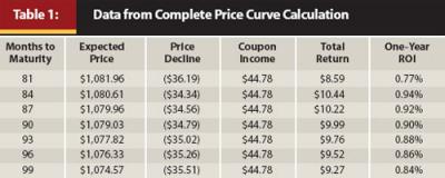
That area peaks around the seven-year mark. Remember, we are buying on the original yield curve and selling or valuing on the new yield curve after a one-year period. By modeling the effect of an interest rate increase, we can determine where to position assets along the yield curve to maximize total return. We can also identify areas of the curve that should be avoided altogether. Rather than sit idly by and watch your clients’ bond portfolios languish in a rising interest rate environment, calculating the expected values as interest rates change can help you be proactive in effectively repositioning fixed-income securities. With rising interest rates, shortening maturities is almost always a good idea, and the price curve confirms that. However, surprisingly, there could be times when extending some maturities also makes sense, and you can also find this from the price curve.
Looking at the shorter end of the price curve for this same security, we can see that if this bond has a maturity of 24 to 33 months, extending its maturity may actually produce a higher total return should we be correct in our future interest rate projections. The calculation works like this: under the recent yield curve where a bond with 33 months to maturity is expected to yield an average of 0.91 percent until maturity, this 4.478 percent bond has a present value of $1,096.66. Twelve months from now it will have 21 months remaining until maturity, but under our projected interest rate scenario, a 21-month bond should be yielding an average of 1.06 percent. This means we project the value of this bond to be $1,059.56 in 12 months, giving us a capital loss of $37.10 and coupon income of $44.78 for a total return of $7.68, or 0.70 percent on our original investment. This is less than the expected return in the targeted maturity range, so we may want to reposition this bond for maximum effectiveness.
The Effect of the Coupon Rate
Calculating a price curve can also be useful in understanding and explaining the effect of the coupon rate on an individual security. The coupon of a bond exerts some inertia on the price of a bond throughout its lifetime. The higher the coupon the more inertia it exerts, or the less sensitive its price is to changes in interest rates, and thus the shorter its duration. The lower the coupon the more freely the price moves in relation to changes in interest rates, and the longer its duration. This is the reason zero-coupon bonds fluctuate so dramatically as interest rates change—they have no inertia to be overcome. If I have a bond with 120 months to maturity, and the yield curve suggests that I should expect an average 3.38 percent yield for that maturity, the coupon is the only other variable we need to account for to calculate the present value. If a bond has a coupon of 4.478 percent, its present value will be $1,092.51. If the coupon is only 3.478 percent, the present value is $1,008.26. And if the coupon is 5.478 percent, the present value is $1,176.77.
A higher coupon shortens the duration of the security and therefore lessens the price volatility of the bond. But rather than a lot of arcane mathematical formulas, calculating the price curve makes it instantly apparent and easier to explain. Also, because of the anchor of maturity value, a higher coupon will result in an earlier price peak and resulting slide to par. The extreme case, of course, is a zero-coupon bond that has the most price volatility relative to changes in interest rates. Unless zero-coupon bonds are purchased with a firm commitment to hold them to maturity to fund a future liability, they are the “kiss of death” in a rising interest rate environment.
Let’s look at the effect of a higher coupon on the expected price curve when rates change. Figure 6 shows how the expected price curve of two different bonds alike in all respects except the coupon payment rates react to changes in interest rates.
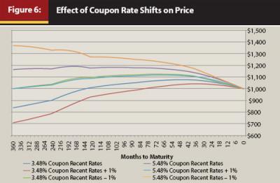
A higher coupon results in less volatility throughout the life of the security; thus if rates rise, positioning client holdings into higher-coupon bonds will mute the effect on their portfolio. Finally, let’s compare the effect of the higher coupon on the total return of the security purchased under a current yield curve and valued or sold under an alternative yield curve.
Let’s imagine we have two bonds with 84 months remaining until maturity. One has a coupon rate of 4.478 percent. The current yield curve suggests that we should average a 2.67 percent average compound rate until final maturity. The present value calculation tells us this bond should be worth $1,114.94. The second bond has the same maturity but a coupon rate of 5.478 percent. The present value calculation tells us this bond should be worth $1,178.41. One year later, interest rates have risen and our bonds now have 72 months until maturity, and are now expected to yield an average of 3.00 percent each year until maturity. The first bond’s new value is $1,080.61, or $34.33 less than a year before. Adding in the coupon income of $44.78 gives us a total return of $10.15, or 0.91 percent on our original cost. The bond with the higher coupon also has fallen in value to $1,135.14, a decrease in value of $43.27; adding back our interest income of $54.78 gives us a positive total return of $11.21, or 0.95 percent on our initial investment.
If we expect rates to rise, it is obvious that bigger coupons are better, but bigger coupons also change the range of optimal maturities you might focus on. So as you increase your coupon rate, you should consider slightly longer maturity ranges.
Table 2 contains a snippet from the price curve data that illustrates an attractive range for investment. Here we have simply sold a lower-coupon bond and purchased a higher-coupon security with the same maturity. Now when we look at total return through an adverse rate change, we find the range of maturities is slightly longer than our original analysis.
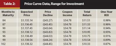
Notice that the area of best protection is very close to the original maturity range because we are using the same yield curve shape and slope, but the expected total returns are higher and spread more evenly because of the higher coupon. Remember, we are assuming a purchase at recent rates and valuation or sale at the alternative yield curve.
Putting the Price Curve to Work in Your Practice
I believe advisers who use individual bonds in client portfolios can benefit from the analysis the price curve offers. But all tools are only as good as the person wielding them.
The first task you will face is developing a view of where you expect interest rates to be in the future. For this task there are some resources you might want to use to at least have a feel for how interest rates have moved in the past. While the past does not equal the future, it can give you a starting point for developing a possible interest rate scenario. An excellent source for seeing how interest rates have fluctuated all along the yield curve can be found at stockcharts.com/freecharts/yieldcurve.html. This dynamic yield curve tool allows you to view the yield curve and its movement through time since 2003. You can run the animation or you can click through frame by frame to see the yield curve and the movement of the S&P 500 side by side. For more historic data, visit the Federal Reserve site, which has downloadable historic interest rate files at www.federalreserve.gov/econresdata/releases/statisticsdata.htm.
You may want to develop multiple interest rate scenarios and test how a bond you own or are considering for purchase will act under each of these scenarios. Or as in a decision tree, perhaps you could weight the odds of multiple interest rate scenarios and use the weighted average of these possibilities for a future yield curve. If you’re really into mathematics, you can even use the price curve as a basis for Monte Carlo analysis.
Once you have developed a future interest rate forecast, you can move on to analyzing how different coupon rates will affect a current or potential bond investment. The price curve can help you identify which coupons will fare better under the assumptions you input into the system. You can analyze individual bonds or use the price curve analytics to measure the expected performance of a client’s entire bond portfolio. Used in this way, the tool opens an opportunity to discuss how bonds work with your clients and ensure they understand the risks inherent in fixed-income investments.
Conclusion
The price curve can be a powerful tool for advisers when trying to build bond portfolios. By learning to think in a third dimension, you may find new opportunities to profit from changing interest rate expectations and anomalies in pricing as bonds move through time. By converting the current yield curve to the implied price curve of the security you are examining, it becomes easier to see and communicate to clients the effects of rising interest rates on their bond portfolio. It allows advisers to quickly and effectively compare the possible performance profiles of various securities in multiple interest rate environments, and hopefully can lead to better security selection. Models can help us as we try to make better investment decisions, but we must be mindful that there are limitations to the application of model data. Tools can make your job easier, but they won’t do your job for you.
Endnote
- The spreadsheet was originally developed in Microsoft Excel. When converted to Google apps, some small variations in calculated values became evident. For example, when I enter the same inputs into Excel, the values come to $1,171.74 and $1,177.70. Regardless of the small variation in outcomes, the concept remains the same. I prefer Excel calculations as they have proven to agree with the values of bonds actually available for client trades.