Journal of Financial Planning: August 2011
Michael M. Garrison, CFP®, is a principal with Chicago Wealth Management Inc., and a portfolio manager of the CWM Fund LP. He has been providing financial and wealth management advice to clients for more than seven years, focusing on sustainable distributions.
Jeffrey G. Cribbs, CFP®, is a managing principal with Chicago Wealth Management Inc., and a portfolio manager of the CWM Fund LP. He has more than 20 years of experience in the investment management industry and has been quoted by national and local media. He holds an MBA with honors from Carnegie Mellon University.
Executive Summary
- This paper examines annual returns of U.S. large-cap equities and U.S. small-cap equities to see if there is return persistency (momentum) over annual periods between the two asset classes that generates excess return.
- Five portfolios are created using historical data (1926–2010) from these two asset classes. The returns of the five portfolios were analyzed from 1927–2010 and rolling annual 5-, 10-, 15-, and 20-year periods.
- The five portfolios are: 100 percent large-cap equity portfolio (LC), 100 percent small-cap equity portfolio (SC), 50/50 large-cap/small-cap equity portfolio rebalanced annually (50/50), last year’s winner portfolio (LYW), and last year’s loser portfolio (LYL). The LYW portfolio invests 100 percent in the previous year’s best-performing asset class, and the LYL portfolio invests 100 percent in the previous year’s worst-performing asset class.
- For the entire period examined, the LYW portfolio had higher compounded annual returns as well as higher risk-adjusted returns than all other portfolios examined, and the LYL portfolio consistently had the worst.
- As the length of the annual rolling periods increased, the frequency of the LYW portfolio having the highest rates of return increased.
- In the annual rolling periods for which the LYW portfolio was not the top-performing portfolio, its worst underperformance and median underperformance were consistently less than the underperformance of all other portfolios.
- This paper concludes that annual investment return persistence has existed between large-cap equities and small-cap equities, and this persistency effect can be easily captured.
The ability to better predict which equity asset class will provide better returns compared with another equity asset class would be a very useful tool for any investor. Knowledge of this factor may lead to a better way of estimating future rates of returns or improved capital market assumptions. This, in turn, could lead to better tactical asset allocation strategies.
Is it possible to predict which asset class is likely to perform better? Callan Associates (www.callan.com) produces an investment return periodic table showing the yearly returns for multiple asset classes to illustrate their yearly return fluctuations. The explicit message from this return chart is asset class returns vary (by a large margin), and it seems impossible to predict which asset class will be the top performer in the future based on the historical pattern of returns. The implicit message is the investor needs to diversify among the asset classes precisely because one cannot predict which asset class will perform best in the future.
However, what if investment returns trend, and there is a way to predict which asset class is more likely to do better than other asset classes in the future? This paper demonstrates that large-cap equities and small-cap equities exhibit annual investment return persistency during the period 1927–2010, and historically there has been a simple strategy to capture this return momentum. Although not helping an investor predict future rates of return for these asset classes, our findings show how an investor may better ordinally rank them for expected future returns.
Literature Review
Much has been written about momentum investing, but the majority of the previous research has examined individual stocks; there has been limited research at the asset-class level. Jagedeesh and Titman (1993) found that “strategies which buy stocks that have performed well in the past and sell stocks that have performed poorly in the past generate significant positive returns over 3- to 12-month holding periods.” They examined past performance based on one, two, three, and four quarters.
Lewellen (2002) extended persistency research by creating portfolios based on firm size and book-to-market ratios. He observed that portfolios based on these factors “exhibit momentum as strong as that in individual stocks and industries.” The size portfolios were broken up into deciles by market capitalization. However, for many investors, applying these techniques would be time-consuming and significantly increase transaction costs.
Dimson, Marsh, and Staunton (2008) demonstrated that equities in the top 20 percent based on past returns outperformed equities in the bottom 20 percent based on past returns by 10.8 percent per year across the entire U.K. equity market from 1956–2007.
Tibbs, Eakins, and DeShurko (2008) looked at more mainstream asset classes or style indices. They found that style indices exhibit significant momentum, but their research only covers the period from January 1969 to December 2005.
We look to extend the research on persistence between common asset classes and use a much longer period than previously examined.
Methodology
Our approach to demonstrating return persistency between large-company and small-company stocks is simple; however, the results are very clear. We used annual historical data from the Ibbotson 2011 Classic Yearbook for the period 1926–2010 for both U.S. large-cap equities and U.S. small-cap equities.
We created five portfolios from this data:
- Large Company (LC): 100 percent investment in large-cap equities.
- Small Company (SC): 100 percent investment in small-cap equities.
- 50/50 Rebalanced (50/50): 50 percent in large-cap equities and 50 percent in small-cap equities, rebalanced yearly.
- Last Year’s Winner (LYW): 100 percent investment in either large-cap equities or small-cap equities depending on which asset class had a higher annual return the previous year. For example, if large-cap equities returned 15 percent in Year 1 and small-cap equities returned 10 percent in Year 1, this portfolio will invest 100 percent in large-cap equities in Year 2.
- Last Year’s Loser (LYL): 100 percent investment in either large-cap equities or small-cap equities depending on which asset class had the lowest annual return the previous year. For example, if large-cap equities returned 15 percent in Year 1 and small-cap equities returned 10 percent in Year 1, this portfolio will invest 100 percent in small-cap equities in Year 2.
We then examined the compounded annual returns of the different portfolios for the entire period from 1927–2010, compounded annual returns over 5-, 10-, 15-, and 20-year rolling periods, and the risk-adjusted returns over this period to see if the return results we discovered were from the existence of outliers. One year of returns was needed for the LYW and LYL portfolios, so the year 1926 was excluded.
We created only one balanced portfolio for this analysis (the 50/50 portfolio); however, an unlimited number of mixed portfolios can be created. Investors and investment managers can vary widely on what allocation they think is appropriate. In today’s marketplace, a close proxy of all of these portfolios could be easily replicated by using an ETF or mutual fund that mimics the S&P 500 Index for large-cap equities and the Russell 2000 Index for small-cap equities.
Overall Performance
The first question we address is which portfolio had the best overall performance over the period 1927–2010.
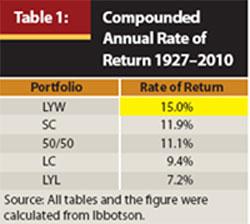
Table 1 shows the LYW portfolio had a much higher compounded annual rate of return (15.0 percent) than any of the other portfolios. The difference in the compounded annual rates of return is significant: the LYW portfolio’s return was more than 3 percent greater than the SC portfolio and more than 5 percent greater than the LC portfolio. We also found it interesting that the LYL portfolio had by far the worst rate of return over this period, suggesting that investors who have rebalanced portfolios by selling last year’s winner and buying last year’s loser may hurt their returns.
Although at first glance this differential in returns is impressive, the results need to be examined more closely to determine whether the LYW portfolio returns were because of a few fortunate moves out of one asset class and into the other. To assess this we performed a rolling period analysis.
Rolling Period Analysis
To determine whether the outperformance by the LYW was consistent, 5-, 10-, 15-, and 20-year annual rolling periods were examined from 1927–2010.
Figure 1 displays the number of 5-, 10-, 15-, and 20-year annual rolling periods during which each portfolio had the best compounded annual rate of return over the period 1927–2010. The first group of columns shows how many 5-year rolling periods each portfolio had the highest rate of return. The LYW portfolio was the best performer in 39 periods, the SC and LC portfolios were the best in 28 and 20 periods, respectively, and the LYL portfolio was the best in 11 periods. The 50/50 portfolio was never the best performer in the rolling period analysis. In the 5- and 10-year rolling periods, there was some overlap between best performers—meaning in some 5- and 10-year rolling periods the LC and LYW or the SC and LYW portfolios had the same returns. After the rolling periods reached 15 years, this overlap was eliminated.
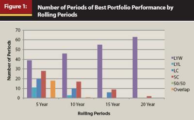
A key observation from Figure 1 is that as the time frame increased, the percentage of instances in which the LYW portfolio was the best performer increased, culminating with the 20-year annual rolling periods (it was the best-performing portfolio in 63 out of 65 periods). It is also interesting that as the length of the rolling periods increased, the number of times the LYL portfolio was the best performer over the period decreased, and it was not the best performer in any 15- or 20-year rolling period.
The results from Figure 1 demonstrate that the LYW portfolio had consistently better returns than any of the other portfolios, and this better performance was not the result of a few outlying or “lucky” return years. We recognize that the shorter the period, the less likely the LYW portfolio will be the best-performing portfolio. Over one-year periods, the LYW portfolio will at best overlap with the best-performing asset class. It cannot be the best on its own by its very nature. However, the LYW portfolio was clearly the best portfolio for the long-term investor.
Level of Underperformance
The degree of underperformance is an important factor as well. Having the highest number of periods of relative outperformance carries much less weight if, when the portfolio underperforms, it underperforms significantly. It is important to observe whether an investment that has periods of outperformance has equally bad periods of underperformance relative to other investments.
Table 2 is derived from looking at all of the 5-, 10-, 15-, and 20-year annual rolling periods in which each portfolio did not have the best returns, then selecting each portfolio’s single-worst relative return compared with the best portfolio. For example, from Figure 1 we know there were 41 5-year rolling periods in which the LYW portfolio was not the top-performing portfolio. In those 41 periods, the most it underperformed the best portfolio was 15.15 percent compounded annually.
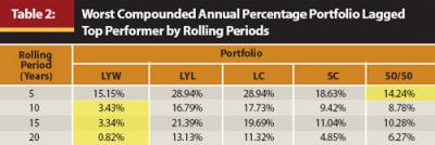
In isolation, this seems like a high degree of relative underperformance and does not appear favorable for the LYW portfolio. However, when compared to the worst single 5-year annual rolling periods of relative underperformance of the LYL (28.94 percent), LC (28.94 percent), and SC (18.63 percent) portfolios, it looks much better. Only the 50/50 portfolio’s worst relative underperformance over a single 5-year annual rolling period was better (14.24 percent). Unfortunately for the 50/50 portfolio, we also know from Figure 1 that it was never the best portfolio over any rolling period examined, so investing in it guaranteed underperformance.
A key observation from Table 2 is that although the LYW portfolio’s worst single 5-year annual rolling period of underperformance was not the best, it was close to the 50/50 portfolio, and over 10-, 15-, and 20-year annual rolling periods, it underperformed by less than all of the other portfolios by a significant margin.
The frequency of high relative underperformance is also critical. Therefore, we assessed the median relative underperformance of each portfolio.
For the results illustrated in Table 3, we looked at all the periods in which a portfolio underperformed the best portfolio and found the median value of this underperformance. When the LYW portfolio was not the best portfolio over a 5-year annual rolling period (41 out of 80 5-year periods), the median amount it underperformed the best portfolio over those 41 periods was about 2 percent per year. In contrast, in 5-year rolling periods in which the LYL portfolio was not the best portfolio (69 out of 80 periods), its median underperformance was more than 8 percent per year.
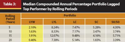
From a portfolio perspective, examining Figure 1 in conjunction with Tables 2 and 3 illustrates that the LYW portfolio was usually the best-performing portfolio. When it did not perform best, it consistently underperformed by less than all the other portfolios. Furthermore, as the time frame increased, the degree the LYW portfolio underperformed was much less than any of the other portfolios. This can be observed by looking at the 20-year annual rolling periods, in which the LYW portfolio underperformed by a median of 0.46 percent, while the LYL and LC portfolios’ median underperformance was 7.38 percent and 5.14 percent, respectively.
Focusing on the LYL portfolio reveals that although it was sometimes the best performer in 5- and 10-year rolling periods (11 and 3 periods, respectively), it was never the best portfolio in 15- and 20-year rolling periods. In addition, when the LYL portfolio underperformed, the magnitude of its underperformance was typically higher than that of the other portfolios. The results show that historically, the LYW portfolio has been a superior strategy to achieve the highest return compared with the others, and rebalancing to last year’s losing asset class has been a sub-par portfolio strategy.
Risk Analysis
A remaining question is whether the LYW portfolio achieved its greater returns with more risk. One of the most common measures of investment risk is standard deviation. Standard deviation measures the volatility of an investment’s return around its mean. Investments with higher standard deviations are deemed more “risky” than those with lower standard deviations.
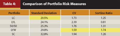
The annual standard deviations of all five portfolios are listed in Table 4. As we can see, the LC portfolio had the lowest standard deviation (20.5 percent) over the period, and the SC portfolio had the highest (32.8 percent). In the classic investment framework an investor should receive more return for taking on more risk. In Table 4 and Table 1, there are two notable exceptions to this relationship among the portfolios tested. Over the entire period, the LYW portfolio had the highest returns (15.0 percent), but only the second-highest standard deviation (29.8 percent). The LYL portfolio had the lowest returns (7.2 percent), but it did not have the lowest standard deviation. From a traditional financial theory perspective, the LYW portfolio had less risk than expected relative to the other portfolios, and the LYL portfolio had more risk.
However, there are a few well-documented problems with using standard deviation as a measure of risk. For one, standard deviation measures risk without consideration of return. As Balzer (2001) points out, “Quite obviously, other things being equal, most investors would prefer less volatile returns to more volatile returns. Other things, however, are not usually equal.” As a stand-alone measure, standard deviation does not necessarily tell the investor which investment is more risky. High standard deviation is not necessarily bad if the mean of an investment’s return is high.
Another shortcoming of using standard deviation as a risk measure is that it does not distinguish between upside and downside volatility. This is not compatible with how investors actually think. Having upside volatility is actually good, and a risk measure that penalizes an investment for this “good” volatility should be used with caution. With the inherent shortcomings of standard deviation as a risk measure, we examined the risk of the portfolios from risk/return and downside risk perspectives.
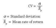
One measure that incorporates both risk and return is the coefficient of variation (CV), which is a measure of risk-adjusted return. Specifically, it measures risk per unit of return. The lower this number is, the less risk per unit of return.
As the returns of all the portfolios vary widely, from 7.2 percent per year (LYL) to 15.0 percent per year (LYW), the risk-adjusted return is a more appropriate measure for comparing the relative risk of the portfolios.
Table 4 shows us the LYW portfolio has the lowest CV, and the LYL portfolio has the highest. In other words, the LYW portfolio has historically provided investors better risk-adjusted returns (less risk per unit of return) than any of the other portfolios as measured by the CV. It is also noticeable how poor the LYL portfolio results are. The ratio indicates that the LYL portfolio has taken more than 20 percent more risk than the portfolio with the next highest CV (the SC portfolio) to achieve its return.
The Sharpe ratio is another risk-adjusted measure used by many investors. The Sharpe ratio measures excess return per unit of risk of an asset. However, by using standard deviation in the denominator, the Sharpe ratio measures total volatility, and as discussed previously, total volatility is not as important as downside volatility. Instead of the Sharpe ratio, we used the Sortino ratio to compare risk-adjusted returns. The Sortino ratio is a modification of the Sharpe ratio, but only penalizes an investment for downside deviation. This ratio treats risk more realistically (why should an asset be penalized for volatility on the upside?) and we therefore used it in our risk analysis. When comparing portfolios, the higher the Sortino ratio, the higher the risk-adjusted return.
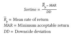
For our analysis, we computed the Sortino ratio using annual data, with the MAR being 0 (the assumption being investors would not be unhappy with any positive return). We measured downside deviations using the MAR as the reference point.
The results in Table 4 using the Sortino ratio are similar to those of the CV, with the LYW portfolio having the highest risk-adjusted return and the LYL portfolio having the lowest risk-adjusted return. Although the LYW portfolio had a higher absolute volatility (as measured by standard deviation) than three of the portfolios examined, it did better than traditional theory would expect it to as evidenced by it having a lower standard deviation than the SC portfolio while having higher returns. In addition, it is clear that on a risk-adjusted basis, the LYW portfolio was historically dominant over all portfolios for the 1927–2010 period. Again, we see that the LYL portfolio was the worst from a traditional framework as well as when using risk-adjusted metrics.
Will the Persistency Continue?
Looking at annual return data of large-cap and small-cap equities demonstrates that there has historically been persistency between these two asset classes over the following year. If there were not, the LYW portfolio would not show the degree of relative success to the other portfolios it has exhibited over this time frame. It is not a huge jump in reasoning to conclude that historically, markets have trended and have not behaved in a completely random fashion. In fact, as Berger, Israel, and Moskowitz (2009) point out, there is overwhelming evidence of momentum effects across markets, asset classes, and time periods, supporting the argument that momentum is not random.
The big question is, “Will this persistency effect continue?” As noted previously, many researchers have documented momentum in equities. However, the big unknown has always been why there is momentum. Although we have not seen research that completely explains why this momentum exists, according to Grinblatt and Moskowitz (2004), most recent explanations focus on behavioral finance. As long as markets continue to be based on human behavior, the shortcomings of the human decision process will likely continue to affect markets, thereby creating asset bubbles and busts along the way. We have seen the behavioral effect throughout history, from tulip mania in Holland and the South Sea Company to more recent trends in technology stocks, financials, and residential real estate. As long as there are economic cycles, we can’t see why these effects wouldn’t continue.
Conclusion
This paper demonstrates that rebalancing strategies that sell short-term winners to buy short-term losers may not be optimal. There has been historical annual investment return persistence between U.S. large-cap equities and U.S. small-cap equities, and this persistence could have been easily captured by adjusting a portfolio on an annual basis. By investing in the recent past’s better-performing asset class, the investor would more likely have experienced significantly greater returns than by investing in any of the other strategies, especially as the length of time using this strategy increased. When the LYW portfolio was not the best strategy, the investor in the LYW portfolio would have consistently experienced less underperformance than by being in any of the other portfolios. Additionally, the LYW portfolio did this with better risk-adjusted returns.
For the short-term investor, the likelihood of the LYW portfolio being the best performer is not as great. For short-term periods, such as one year, the LYW portfolio never outperforms the best asset class, because at best it can only be invested in this class. In addition, trend-following strategies may be subject to higher losses in decreasing markets, especially over the short term. Applying these techniques on a monthly basis (instead of annually as we have done) would likely lead to periods in which a whipsawing effect could occur, leaving the investor worse off. However, as the investment period increases, the potential negative effects of higher losses in decreasing markets along with the whipsawing effect are overcome by the better returns over longer periods. In our analysis, when longer rolling-period returns are examined, it is apparent that by using both U.S. large-cap equities and U.S. small-cap equities, the LYW portfolio was able to provide significantly greater returns than either asset class by itself, a 50/50 rebalanced strategy, or a strategy that invested in last year’s loser. For the long-term investor, looking to incorporate this persistency effect may be very beneficial.
As we noted above, we recognize this analysis is relatively simple, and we believe there is much more research to be done in the area of asset-class momentum investing. Adding additional asset classes, changing the length of the rolling periods, and doing monthly analysis are three areas ripe for further research.
References
Balzer, Leslie A. 2001. “Investment Risk: A Unified Approach to Upside and Downside Returns.” In Managing Downside Risk in Financial Markets. Frank A. Sortino and Stephen Satchell, eds. Oxford, UK: Reed.
Berger, Adam L., Ronen Israel, and Tobias Moskowitz. 2009. “The Case for Momentum Investing.” AQR White Paper (Summer).
De Bondt, Warner F. M., and Richard H. Thaler. 1985. “Does the Stock Market Overreact?” Journal of Finance (July): 793–805.
De Bondt, Werner F. M., and Richard H. Thaler. 1987. “Further Evidence on Investor Overreaction and Stock Market Seasonality.” Journal of Finance 42: 557–581.
DeMarzo, Peter M., and Ron Kaniel. 2008. “Relative Wealth Concerns and Financial Bubbles.” Review of Financial Studies 21, 1: 19–50.
Dimson, Elroy, Paul Marsh, and Mike Staunton. 2008. ABN AMRO Global Investment Returns Yearbook 2008. Amsterdam: ABN AMRO Bank NV in association with the Royal Bank of Scotland and London Business School.
Grinblatt, Mark, and Tobias J. Moskowitz. 2004. “Predicting Stock Price Movements from Past Returns: The Role of Consistency and Tax-Loss Selling.” Journal of Financial Economics: 541–579.
Jegadeesh, Narasimhan, and Sheridan Titman. 1993. “Returns to Buying Winners and Selling Losers: Implications for Stock Market Efficiency.” Journal of Finance (March): 65–91.
Lewellen, Jonathon. 2002. “Momentum and Autocorrelation in Stock Returns.” Review of Financial Studies (Special): 533–563.
Prechter, Robert R., Jr. 2001. “Unconscious Herding Behavior as the Psychological Basis of Financial Market Trends and Patterns.” Journal of Psychology and Financial Markets 2, 3: 120–125.
Sharfstein, David S., and Jeremy C. Stein, 1990. “Herd Behavior and Investment.” American Economic Review 80, 3: 465–479.
Sortino, Frank A., and Lee N. Price. 1994. “Performance Measurement in a Downside Risk Framework.” Journal of Investing (Fall): 59–64.
Tibbs, Samuel L., Stanley Eakins, and William DeShurko. 2008. “Using Style Index Momentum to Generate Alpha.” Journal of Technical Analysis 65: 50–55.