Journal of Financial Planning: April 2019
Robert Dubil, Ph.D., is a professor of finance at the University of Utah in Salt Lake City, Utah. His current research interests span derivatives, risk management, and personal finance.
Executive Summary
- An inverted yield curve slope of 10 years minus three months has predicted the last 10 recessions. The typical sequence is a curve inversion, followed by a sharp stock market drop, negative GDP period (recession), interest rate drop as the Fed reverses course, and sometimes a stock market recovery. The time from the short rate rise and the curve inversion to the GDP recovery and the end of the recession is about 24 months.
- Investors tend to shift some assets from equities to fixed income to avoid recession-driven stock market losses, and within fixed income into shorter durations to limit losses due to interest rate rises. This paper examines whether that long-to-short shift makes sense, and if so, how to best implement it.
- Two theoretical experiments and one empirical experiment were conducted. The main finding is that performance was driven by the long-term rate, not the slope of the curve. For short-horizon investors, the intuition to shorten the duration is correct.
- The trade-off is less clear with bond funds and longer horizons. If the 10-year moves little, the coupon advantage of long bond funds makes staying in them preferable over shifting to short funds.
- In the empirical illustration with corporate bonds over the 2016 to 2018 period of six interest rate hikes, while the curve flattened dramatically, the move in the 10-year was so large that short bonds outperformed long bonds for all studied issuers.
Individual investors rarely give much thought to their fixed income holdings. Financial planners help their clients stick to the risk-appropriate overall asset allocation, and then often focus largely on equities: the long-term, largely passive, core portfolio, plus short-term tactical shifts between value/growth, domestic/international, or defensive/cyclical. Yet, as more investors near or enter retirement, the investment horizon shrinks. The tactical shifts matter more and they hold more dollars in fixed income. Therefore, the returns and the risk profile of fixed income matter more.
The context of this paper is fixed income strategies in view of impending recessions. 2008 was a harsh lesson for near-retirement investors. Yet, arguably, in advising clients we have gone back to the textbook long-term steady glide path orthodoxy with no advice for people with 10- to 15-year horizons.
Recessions happen regularly. When they do, it is often a double storm. The Fed hikes short rates aggressively, the yield curve rises and inverts. Investors lose money in their fixed income portfolios. Then, stocks drop precipitously and investors lose money in their equity allocations just as the GDP shrinks and the economy contracts. It is not enough to tell your 70-year-old retiree client not to worry and to hold steady.
No one can predict the path of interest rates, the stock market, or the timing of the recession. However, financial planners can, at times, adopt defensive recession-mitigating strategies.
The first part of this paper documents the strong historical relationship between the yield curve inversions and recessions. The macroeconomic theory underlying the linkage is tenuous, yet the empirical research is rich and convincing. The spread between the 10-year Treasury note and the three-month T-Bill preceded by up to 12 months the last 10 recessions going back to 1952 100 percent of the time. Any other short rate benchmark up to two years worked almost as well as a predictor. In almost all cases, both the long and the short rates rose, with the short rate rising more rapidly. A U.S. stock market drop immediately followed the rate inversion.
The start of the GDP contraction followed the market drop. There is no perfect statistical or economic causality, but Ang, Piazzesi, and Wei (2006), and Estrella and Trubin (2006) showed that the sequence is explained by the Fed proactively hiking interest rates during an upswing in the business cycle. Research in the vector autoregressive setting shows that it is the short end of the curve, and not the slope, that has strong correlation to a one-period forecasted log GDP.
A common approach to Fed hikes is to shorten the modified duration of bond holdings to limit capital losses. Yet, if the Fed raises short rates aggressively, and as the expectations hypothesis asserts, the short rates propagate slowly to the long rates, the curve is likely to invert, the short rate may rise a lot, while the long rate may rise less or not at all. A short-duration portfolio may suffer while the long one does not. The cost of switching to shorter-duration bonds is also a lower coupon cash flow, because the yield curve is upward sloping prior to rates rising.
The second part of this paper focuses on the strategies investors should adopt before recessions, specifically regarding shifts within fixed income, not between equities and fixed income. Those strategies were examined in two ways. First, with two theoretical barbell experiments. Because the window from the rate hikes and the curve inversion to the end of the recession is typically about two years, this paper traced parallel long- and short-maturity bond positions over a 24-month horizon.
The first experiment looked at holding individual two-year versus 10-year Treasury notes; the second looked at holding short and long bond funds. The two-year was chosen as the short-rate proxy for the ease of demonstrating the main difference. When holding individual bonds, the short bonds mature by the end of the time window. In relative terms, the short funds have capital losses while the individual bonds do not. At the long end, both bonds and bond funds have capital losses. The experiments took the barbell strategies through rate paths similar to those that have been observed in past recessions. The experiments apportioned the return performance to the duration, convexity, and maturity effects of the capital gains, plus the non-reinvested coupon cash flow.
The second way the strategies were examined was through an empirical analysis of corporate bond performance over the 2016 to 2018 period of six interest rate hikes. It does not prove by any means that shifting into short-duration securities helps, because the study covered only one historical period. It is offered as an illustration of what individual investors can achieve on their own in the post-2008 corporate bond market, where many regulatory capital-constrained bond dealers have exited, the market has become more volatile and thinner, and the playing field between retail and institutions has become more level.
Switching to short bonds dominated staying in long bonds in the first and the third experiments. In the first experiment, maturing short bonds did not suffer any losses while the coupon flow advantage of the long bonds was overrun by the capital losses. In the third empirical experiment over the 2016 to 2018 period while the curve flattened dramatically (from 80 bps to just 29 bps), the move in the 10-year was so large that all short bonds outperformed long bonds. In the second study of bond funds (rather than individual bonds), the rationale for switching largely disappeared.
As managers rebalance to maintain the duration mandate, short duration funds have capital losses, and the original coupon advantage of long bond funds may make staying in them preferable. Although a long-term investor should never switch to earn the coupon advantage and ignore a couple of years of risk, in the context of this paper (as in all tactical decisions), the best prescription depends on knowing the unknowable—here, the size of the 10-year rate rise. The result then has to be interpreted using the historical evidence of the first part of the paper, which was that while the short rate rises dramatically and ultimately causes the inversion and the recession, typically the long rate moves, too, meaningfully enough to likely lead to sizeable capital losses.
The Link Between the Shape of the Yield Curve and Lagged GDP Growth
Bullard (2018) broke down the previous research into the link between the inverted yield curve and the GDP into three parts as of the end of 2018. The first part showed the evidence that the curve was inverting; the second showed the theory of inflation, real rates, and nominal rates formation; and the third showed the empirical evidence of the correlation of the shape of the curve to lagged GDP. The literature review here will follow this sequence.
The nominal spread between the 10-year Treasury note and the one-year T-Bill has been steadily declining over the period 2013 to 2018 (Figure 1). Most of the flattening is due to the rising short rates; the long end has moved little, as shown in Figure 2.
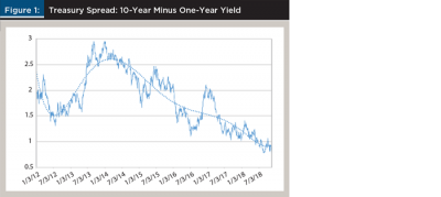
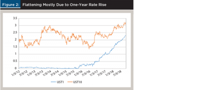
In Figures 1 and 2, one could substitute any T-Bill rate with a maturity of less than a year for the one-year rate to produce an identical picture. The one-year tracks very closely to the Federal Open Market Committee (FOMC) policy rate.
The theoretical rationale for why the slope of the curve is a leading indicator of recessions is tenuous and only through the expectations hypothesis of interest rate formation in standard macroeconomic theory. Neglecting term premiums, the theory states that a spot long rate is a blend of the current spot short rate and future expected short rates up to the full term. The slope of the yield curve is, therefore, a measure of the current stance of the monetary policy relative to the long-run expectations. The higher the spread the more restrictive the current policy; the more restrictive the current policy, the more likely subsequent recession.
Harvey (1988), and Estrella and Hardouvelis (1991) both studied the relationship between the yield curve and consumption, output, and inflation, and future expected short rates, and therefore, how current long rates determined future output and inflation. Long-term nominal rates are the sum of real rates (related to productivity and output) and inflation (price level). As a result, the link between short rates and future GDP is indirect through long rates. If long-term inflation expectations remain low, then long-term rates can stay low despite higher short rates and despite positive real rates, which reflect future output.
A related theoretical consideration is the Phillips (1958) curve of inverse relationship between inflation and unemployment. In the context of this paper, inflation is a driver of the nominal rates, and unemployment is an inverse driver of the GDP. Recently, the curve predictions have failed empirically. In the 1970s, there was high inflation and high unemployment (stagflation). In 2018, there was low inflation and low unemployment. Both phenomena contradicted the curve’s predictions. Rational expectations and non-accelerating inflation rate of unemployment (NAIRU) theories came to replace the implied money illusion of the Phillips curve.
The empirical literature on the yield curve and GDP has several strands of research: inflation expectations and real rates extraction from Treasury inflation-protected securities (TIPS); the direct research into the correlation and causality between the yield curve and recessions (negative GDP growth); and the statistical refinement into the best predictors.
Relative to the first two strands, Bullard (2018) showed that as of the end of 2018, real rates have been relatively constant in the U.S. since 2013 and have been very low or negative in the developed markets, reflecting the expectations that GDP growth is slowing. Since the so-called “taper tantrum” of early 2013, the real rate in the U.S. (extracted from the 10-year TIPS yields) has hovered around 0.5 percent, rising slightly at the end of 2018. The real rate extracted from inflation-linked U.K. bonds (gilts) trended down from 0.5 percent in June 2014 to –0.6 percent in 2018. And the real rate extracted from inflation-linked 2030 German bonds (bunds) trended down from 0 percent in January 2014 to close to –2 percent in 2018. Relative to the third strand of the empirical literature, Bullard (2018) highlighted how the 10-year versus one-year, two-year, or three-month slope perfectly predicted the last three recessions.
Estrella and Mishkin (1996) first examined the question of which short rate to select. They documented that the spread between the 10-year Treasury note and the three-month T-Bill beats all other indicators as the best predictor of recessions two to six quarters ahead. That spread predicted the last 10 recessions without a fail.
Romanchuk (2016, 2017) studied the 10-year minus the two-year or minus the five-year versus GDP. He pointed out that any Treasury rate up to two years could serve as an almost perfect proxy for the Fed policy (fed funds rate), but the link breaks once one moves to longer rates. This paper used that finding to use the two-year rate as the short proxy that also happened to match the pre-recession and recession time windows.
Based on the previous research, the Federal Reserve Bank of Cleveland developed a predictive model of future recessions, which it updates monthly.1 It uses the 10-year minus the three-month Bill applied in a probit forecast. The advantage of the model is to have the probability of the recession, rather than the curve slope, on the vertical axis.
The fourth strand of the literature delves into the econometrics of the recession prediction models. Ang, Piazzesi, and Wei (2006) explained that ordinary least squares (OLS) models do not account for regressor endogeneity. Their vector autoregressive model of yields on maturities up to 20 quarters demonstrates that the short rate has much more predictive power than any term spread. The first principal component related to the short rate accounts for 97.2 percent of the variation of the yields, the term slope only adding 2.5 percent. Ang, Piazzesi, and Wei (2006) also showed Granger-causality between previous high short-term rates and subsequent low GDP growth, and the statistical insignificance for the term spread. That is, rising short rates cause recessions, but the slope is also significant.
Estrella and Trubin (2006) built a curve-based recession signal and proved that, in subtracting from the 10-year, the three-month beats any other short maturity. The 10-year minus the three-month slope perfectly predicted recessions when it was negative, irrespective of how negative, as long as the negative differential persisted for days, not just intra-day. The differential was a superb predictor irrespective of what happened to the 10-year. They confirmed the proactive policy of the Fed and the rising three-month rate as the dominant factors leading to recessions.
Another proof of the significance of the short rate itself over the term spread (slope) is Wright (2006), who tested using the federal funds rate in addition to the term spread in the probit setting that the Fed employs for its predictive modeling. He documented much improved in-sample and out-of-sample predictive power.
The summary of the econometric research into the link between the yield curve shape and the negative GDP change six to 12 months later is shown in Figure 3 and Figure 4. Figure 3 plots the one-year and the 10-year rates separately and superimposes the last seven recessions as defined by the National Bureau of Economic Research since 1962. By plotting the two rates separately, Figure 3 shows the crossing of the two curves (the inversion) and the rise in both rates immediately preceding each recession.
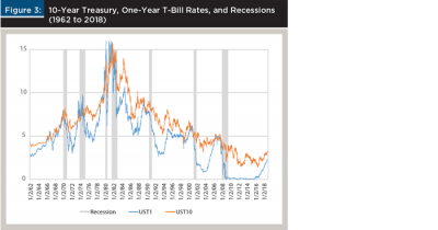
Note that in Figure 3, the 10-year Treasury rate always exceeds the one-year T-Bill rate, except right before the recessions. This implies that a long-term investor who can ignore intermediate-term fluctuations should always invest in 10-year notes to take advantage of the higher interest cash flow.
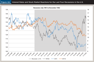
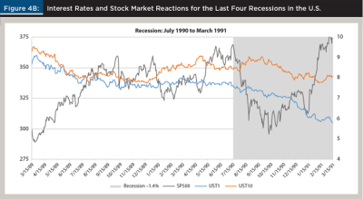
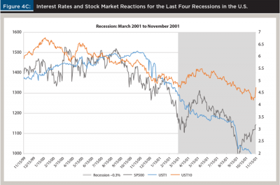
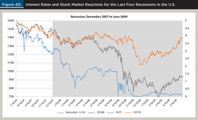
The four panels of Figure 4 look at 24-month windows surrounding the last four recessions in 1980 to 2018 timeframe. Those recession lasted six, eight, eight, and 18 months, or an average of 12.5 months. The peak-to-trough GDP contractions ranged from –0.3 percent to –5.1 percent. The end of each graph coincides with the end of the recession (the last month of negative GDP growth). In addition to the one-year and 10-year rates and shaded recessions, the plots show the S&P 500 index level (ex-dividend).
Although the exact sequence varied from recession to recession, the pattern is clear. The two rates rise, the one-year rises more and crosses above the 10-year, the stock market drops almost immediately after the inversion, and the GDP sometimes contracts earlier, sometimes with some lag. In the relatively shallow recession of 1990, the lag between the inversion lasted only a few days in June and July 1989, and the onset of the recession and the stock market drop in July 1990 was the longest lag period at 12 months. The other three recessions followed the typical pattern of more immediate and sharper reactions.
The plots also show the decline in the one-year rate halfway through the recession as the reflection of the Fed’s reaction to lower the policy rate. The graphs do not follow what happens immediately after the recession; sometimes the visible stock market spike is only temporary.
Experiments 1 and 2: Long versus Short Individual Bonds
An investor facing a curve inversion, a stock market drop, and a recession may reallocate from equities to fixed income and within fixed income. This paper explores how to reallocate within fixed income, into long- or short-duration bonds, focusing on tactical shifts of a more risk-averse or older investor.
The answer depends on the time horizon. A short-term trader sets up a duration-weighted short position in the two-year and a long position in the 10-year to make money from a flattening or an inversion. On the other end of the spectrum, an infinite-horizon retirement saver ignores intermediate-term curve changes and invests only in long-term bonds or tilts toward them to take advantage the higher coupon flow due to the fact that the yield curve is upward sloping two-thirds of the time. Without perfect foresight, one cannot predict if the curve will shift or invert, but using historic insight might minimize intermediate-term losses.
Recessions may have similar sequence of interest rate, stock market, and GDP events, but each one starts with a different absolute level of rates and a different shape of the curve. In Figure 4, the first two pre-recession periods had very high rate levels, but the curves were relatively flat or inverted long before the stock market drop. The last two pre-recession periods had much lower rate levels and relatively steeper curves.
This paper chose the starting point as U.S. Treasury yields and prices on February 16, 2018 (see Table 1). This is somewhat arbitrary, but it reflects the current low absolute level and medium steepness of the yield curve. This analysis used Treasury coupon rates/prices rather than spot (zero-coupon) or forward rates to be consistent with the past economic studies on recession predictions cited earlier and with most investors’ holdings of bonds and bond funds.
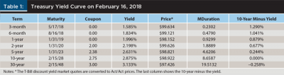
In addition to yields/prices, Table 1 shows the modified duration of each security and the spread to the 10-year. The starting 10-minus-2 spread is 0.677 percent; the curve is upward sloping as is typical in non-recession periods.
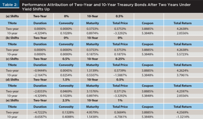
Experiment 1 is a horse race of two investors over a 24-month horizon. The first investor, fearing the coming recession, switches to lower-duration two-year Treasuries. The second investor stays in 10-year Treasuries in order to ride the yield curve, taking advantage of the upward sloping curve at the outset.
Figure 5 shows five likely scenarios of yield curve movements as the recession approaches. The scenarios blend parallel shifts up and down with slope changes due to the flattening or steepening of the curve. They are defined in subsequent tables by a tuple of shifts of two points of the yield curve: the two-year and the 10-year (rather than by the parallel shift plus shape).
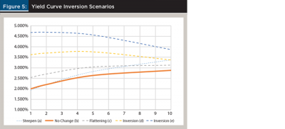
Scenario (b) in Figure 5 is a no-change scenario. Scenario (a) is an unlikely 0.5 percent steepening counterexample, just for comparison purposes. Scenarios (c), (d), and (e) have the flattening/inversions paired with shifts up, which is likely to occur as the recession approaches.
Table 2 shows the results of the horse race over the five yield scenarios. Each bond had a loss due to the duration effect (parallel shift) offset by a gain due to convexity (curvature of the price-yield function), and a gain due to maturity shortening over time (a 10-year bond becoming an eight-year bond, or a two-year bond converging to par at maturity). The bonds also earned coupon interest. Thus, the performance of each strategy came from three components of the capital gain: duration, convexity and time, and coupon component (or the coupon cash flow).
Mathematically, this was an exercise in partial derivatives. Most textbooks consider two measures of interest rate risk: duration (linear) and convexity (quadratic). The modified duration is defined as the percentage change in price divided by a change in the yield to maturity. Convexity is defined as the change in the duration per change in the yield (sometimes divided by 2).
Both interest rate risk measures were instantaneous and lack a time dimension. In practice, yield changes ∆y occur over discrete time ∆t, not instantaneously. Therefore, the percentage changes in the value of a bond ∆P/P can be broken down into three components, informally written as:
The first two components of the capital gain keep time constant and travel along the convex price-versus-yield curve decomposing into the linear, and the remaining non-linear value changes. In the third component, time elapses (maturity shrinks) but the yield stays the same. Technically, a ∆y∆t cross-term is omitted, so the three effects add up to the entire capital gain with a negligible error.
In Table 2 and Table 3, the non-reinvested coupon cash flow was added as the fourth and final component of the investor’s return (analogous to dividend in equities, or rent flow in real estate, unrelated to the price gain/loss) over the entire holding period.
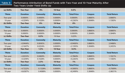
Figure 6 illustrates the price change decomposition for a holder of a 10-year bond in Table 2 and a holder of a 10-year target maturity bond fund in Table 3. The yield level is low in absolute terms and the picture is magnified, so some of the curvature is difficult to see.
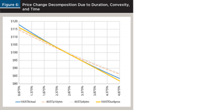
The holder of the 10-year 2.75 percent coupon bond starts at the yield of 2.875 percent and the price of $98.922. The solid blue line shows the actual convex relationship of the price to yield of the 10-year bond. The solid yellow line is straight and is a tangent duration approximation to the convex line. If the yield to maturity rises by 1.5 percent to 4.375 percent, the holder’s instantaneous capital loss is decomposed into the duration loss (travel down the straight yellow line) offset by a small convexity gain (back up to the actual curved line). This is the standard decomposition of the price function into a linear and a quadratic term.
Figure 6 captures the time change by drawing a dashed orange line of an eight-year bond with the yield 2.875 percent. As the yield increases over time, the holder of the bond loses money due to duration, offset somewhat by the positive convexity, but also, while this is happening, the bond’s maturity shortens and the holder ends up with an eight-year bond.
An individual bondholder of Table 2, as opposed to the bond fund holder of Table 3, captures the vertical distance from the convex blue line of the original 10-year bond to the convex (but flatter) orange line of the final eight-year bond. Note that the bondholder may gain even more. The dotted gray line represents the additional gain due to the fact that originally the curve was upward sloping and eight-year bond yields were 0.098 percent lower than 10-year yields (interpolated between 10- and 5-year points). The yield curve moves up in parallel, but the bondholder slides down from the 10-year to the eight-year point. That potential extra gain is omitted in Table 2 and Table 3 because the tables consider curve inversion scenarios (i.e., slope changes). The main difference between Table 2 and Table 3 is the fact that a bond fund holder maturity does not shrink from 10 years to eight years as the fund’s mandated duration is maintained.
For simplicity of exposition, Table 2 with two-year and 10-year bonds was deliberately constructed over a two-year holding horizon, because over that period, the two-year bond matures, and the total price effect is equal to par minus the starting price. If the bond started at a premium, the total price effect would be negative paired with a higher coupon flow. A par two-year would suffer no capital loss. Here, the bond started at a slight discount, so the total price effect was slightly positive. The sum of the effects should be identical in all five scenarios, except for the cross-term error.
The convergence to maturity of the short-term bond is the key to understanding the difference between the performance of the individual bond (Table 2) and bond fund (Table 3) strategies. In Table 2, two-year bonds mature. In Table 3, a bond fund with a two-year mandate is rebalanced to still have two years to maturity at the end of the time window and will have a larger capital loss.
In panel (b) (“no change”) of Table 2, the 10-year wins (predictably) mainly due to the higher coupon accrual over the holding horizon. The price of the two-year converges to par while the price of the 10-year moves slightly and only due to time passage, because yields do not change. The higher coupon flow of the 10-year drives its outperformance.
In panel (a) of Table 2, the curve steepens because the 10-year yield goes up. The two-year returns the same as in the “no change” scenario, but the negative 10-year price action more than undoes the entire coupon flow advantage.
Panels (c), (d), and (e) illustrate the main lesson: the driving effect is not the steepening per se, or the slow or rapid rise in the two-year; it is a concurrent rise in the 10-year, no matter how small. The two-year is unaffected by the curve shifts: the would-be duration loss is offset by the convergence to par as the bond matures. The losses in the 10-year are all due to the high duration of the 10-year bond (= 8.6587). In panels (c) and (d), the 10-year underperforms, but the total return is positive. In panel (e), the 10-year rises by a full 1 percent, and the capital loss is bigger than the coupon flow.
The no-change panel (b) is the only counter example favoring owning the longer-term bond. The 10-year rate does not rise, there is no capital loss, and the coupon accrual on the 10-year bond is higher than on the two-year note.
The difference between individual bonds and bond funds is in the time/maturity effect on the price. With individual bonds, the bond maturity shortens over the holding horizon. The two-year matures and the 10-year becomes an eight-year. This affects the discounting time, but it may also affect the yield-to-maturity if it decreases down the upward-sloping curve. Only the first impact is captured in Table 2 as a partial derivative effect.
Investors holding bond funds do not gain from either aspect of the maturity effect. The funds are continuously rebalanced to meet the duration mandates. As time goes by, the net asset values (NAVs) of the short and the long bond portfolio are still proxies for the same two-year and the same 10-year bonds, respectively.
Table 3 shows the performance of bond fund strategies. The total returns are lower than in Table 2 because the positive maturity effect is zeroed out. In Table 3, there are three counter examples. The 10-year not only outperformed in the no-change panel (b), but also in the mild inversions paired with small 10-year moves in panels (c) and (d). When the curve inverts and the 10-year rises dramatically in panel (e), both strategies produced negative returns, with the 10-year underperforming, but by much less than in Table 2, panel (e).
The upshot is that unless the long end of the yield curve is expected to move up substantially, dumping a long fund for a short one may not make sense. The longer the holding horizon, the less so. The main risk is not the inversion, but the upshift in the long end.
A practical aspect of the fund industry is that most “long” bond funds have discretion over their duration as long as they stay “long” (e.g., six years by Morningstar). If managers shorten their durations within their mandates in anticipation of yield curve shifts, there may be no need for investors to shift into shorter funds.
A statistical fine point concerns corporate bonds and funds. The corporate spread curve (the extra yield on top of Treasury yield) is typically upward sloping. The coupon advantage of long- over short-term corporate bonds may be even larger than for the Treasuries in Tables 2 and 3. Investors in corporate bond funds (the largest investment-grade ETFs are iShares’ LQD and AGG) may have less incentive to switch to shorter-duration funds.
Also, as the yield curve moves up, inverts, and the possibility of a recession rises, the spread curve may change differently for high versus low credits. High-yield short spreads may move less than long spreads if long bonds become substitutes for equities as default probabilities rise toward bankruptcy. High-grade short spreads may increase relatively more than long, as these issuers are likely to survive the recession. High-grade long corporate bond funds’ coupons may greatly offset the limited capital losses.
Experiment 3: Corporate Bond Strategies over the July 2016 to July 2018 Curve Flattening
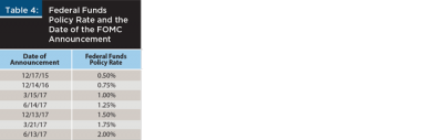
The two years between July 2016 and July 2018 saw six Fed rate hikes. The yield curve flattened significantly with both the two-year and the 10-year points rising. This section is a simple check on the realized performance of holding individual two-year and 10-year corporate bonds of six issuers. The six companies are from the eight used in Dubil (2017). Two companies experienced credit downgrades and were subsequently dropped from this analysis. Dubil (2017) showed disparities in the prices for bonds of the same issuer with similar maturity and coupon on any given date and over time. The relevance of that study is that the results were sensitive to the selection of specific bonds. To avoid any bias, this study included the two closest bonds for each the two- and the 10-year points. To put the results in a historical context, Table 4 first lists the dates of the Fed hikes.
The experiment assumed buying bonds on July 6, 2016 and holding them for exactly two years. Figure 7 shows the Treasury coupon curves at the starting point on July 6, 2016, halfway through the two-year period, and on July 6, 2018.
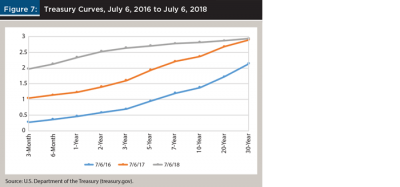
During the period studied, the two-year rate increased by 1.95 percent to 2.53 percent, and the 10-year rate increased by 1.44 percent to 2.82 percent. The curve flattened to just 0.29 percent with subsequent anticipated hikes threatening to invert it.
The dataset collected over time from the Bond Desk application (www.bond
desk.com) contains bid and ask prices for more than 400 corporate bonds issued by Verizon (VZ), Bank of America (BAC), Boeing (BA), Ford Motor (F), Target (TGT), and Caterpillar (CAT). For each issuer, four bonds were chosen: two bonds closest in maturity to two years, and two closest in maturity to 10 years on July 6, 2016.
Consistent with Table 2, the bonds were observed over the following two years. The two-year proxies either matured or were close to maturing by July 6, 2018. The 10-year proxies shrank in maturity to about eight years. The bonds were bought at the ask price on July 6, 2016. The return calculations assumed that the bonds were sold at the ask price on July 6, 2018; the ask price was chosen to avoid including the retail bid-ask spread of the indicative bond quotation system. The bid price is shown for reference (see Table 5).
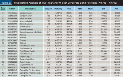
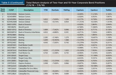
To keep the results comparable to the theoretical experiment of Table 2, the total return was broken down into the actual capital gain and the coupon accrual, and the capital gain was attributed to the price change due to the duration response (modified duration times the change in the yield to maturity) and the unattributed rest (convexity, time, random). The yield to maturity at the time of the sale, which includes the corporate spread, is highlighted. The realized performance attribution is shown in Table 5.
In Table 5, the two two-year positions are separated by a white line from the two 10-year positions. The main result is quite clear: there were no negative returns in two-year positions. The capital losses were offset by the coupon accruals. The only significantly negative returns were in 10-year positions. For lower-coupon 10-year bonds, the coupon accrual was often not large enough to counteract the capital loss. This is not surprising; the 10-year Treasury yield over that period moved up by 1.44 percent. Multiplied by the modified duration, which in Table 5 varies in the 7 to 9 range, one would expect 11 percent to 12 percent capital gain losses. Observed capital losses were slightly lower due to positive convexity, the shortening maturity by two years, and perhaps corporate spread change. Once again, the results highlight that the risk is not the flattening, but the rise of the 10-year yield.
Implications for Financial Planners
Financial planners build asset allocations to match their clients’ risk appetites. For older, cash-constrained, or more risk-averse clients, the investment horizon is rarely infinite. In addition to keeping an eye on long-term savings goals, financial planners make reallocation decisions in response to looming recessions, or dramatic shifts in relative asset class performance. This paper deals with a scenario in which the economy, as a result Fed rate hikes, approaches a recession, expected equity returns turn negative, and investors consider reallocating to fixed income and within fixed income, to lower-risk bonds.
This paper redefined how to think about the risk of recession to investors. The risk is not the curve inversion, but the reaction of the long end of the curve. Meanwhile, econometric studies have demonstrated that the inverted slope and even more strongly the rise in the short rate cause or help predict recessions.
Although it is not possible to predict interest rate changes, it is useful to break down the scenarios into separate short-term and long-term moves and to examine the performance of different tactical moves. The experiments explored in this paper with individual bonds showed that shifting from long-term to short-term bonds works. The coupon flow of the short bonds more than offset the near zero capital loss due to their low modified duration; meanwhile, the long bonds lost money as soon as rates rose even a little.
The experiment with bond funds showed a more complex picture. Because the funds maintained their duration mandates, as rates rose, both short and long bond funds had capital losses. If the starting yield curve was steep enough and/or the anticipated move in the long rate was small enough, the initial coupon advantage of the long bonds meant that staying in long bonds may have been better.
The empirical study of holding corporate bonds over the 2016 to 2018 timeframe strengthened the argument for shifting to shorter bonds. Over this period, the curve flattened significantly, but what hurt investors was the move in the 10-year rate, even though the curve was steep to start with and long bonds enjoyed a large coupon advantage.
The experiments in this paper are imperfect. Each recession—its causes, and the pattern of interest rates leading into it—is different, so one cannot come up with any general prescriptions. Also, investors have different time horizons, and so this paper is by its nature intermediate-term and tactical, and does not fit neatly into the mean-variance investment theory of a long-term saver.
The important lesson from the experiments in this paper is perhaps that financial planners should not treat fixed income as one big block that mitigates the risk of equities. Rather, they should help educate clients about the interest rate risk within fixed income. This is particularly applicable to older clients with larger allocations, and in the face of aggressive rate hiking by the Fed.
Endnote
- See “Yield Curve and Predicted GDP Growth, January 2019,” from the Federal Reserve Bank of Cleveland, available at clevelandfed.org/our-research/indicators-and-data/yield-curve-and-gdp-growth.aspx. The data is available at newyorkfed.org/medialibrary/media/research/capital_markets/Prob_Rec.pdf.
References
Ang, Andrew, Monika Piazzesi, and Min Wei. 2006. “What Does the Yield Curve Tell Us About GDP Growth?” Journal of Econometrics 131 (1-2): 359–403.
Bullard, James. 2018. “Assessing the Risk of Yield Curve Inversion: An Update.” Glasgow-Barren City Chamber of Commerce Quarterly Breakfast presentation. Federal Reserve Bank of St. Louis. Available at stlouisfed.org/~/media/files/pdfs/bullard/remarks/2018/bullard_glasgow_chamber_20_july_2018.pdf?la=en.
Dubil, Robert. 2017. “Is It Time to Switch from Bond Funds to Individual Bond Buying?” Journal of Wealth Management 20 (3): 45–51.
Estrella, Arturo, and Gikas Hardouvelis. 1991. “The Term Structure as a Predictor of Real Economic Activity.” Journal of Finance 46 (2): 555–576.
Estrella, Arturo, and Frederic S. Mishkin. 1996. “The Yield Curve as a Predictor of U.S. Recessions.” Current Issues in Economics and Finance 2 (7): 1–6.
Estrella, Arturo, and Mary R. Trubin. 2006. “The Yield Curve as a Leading Indicator: Some Practical Issues.” Current Issues in Economics and Finance 12 (5): 1–8.
Harvey, Campbell R. 1988. “The Real Term Structure and Consumption Growth.” Journal of Financial Economics 22 (2): 305–333.
Phillips, Alban W. 1958. “The Relation Between Unemployment and the Rate of Change of Money Wage Rates in the United Kingdom 1861–1957.” Economica 25 (100): 283–299.
Romanchuk, Brian. 2016. Interest Rate Cycles: An Introduction. Bond Economics. ISBN 978-0-9947480-4-1
Romanchuk, Brian. 2017. “Quick Update, Slope Comment.” Bond Economics. Blog posted Oct. 18, 2017. Available at bondeconomics.com/2017/10/quick-update-slope-comment.html.
Wright, Jonathan H. 2006. “The Yield Curve and Predicting Recessions.” Finance and Economics Discussion Series 2006-07. Federal Reserve Board, Washington, D.C., available at federalreserve.gov/pubs/feds/2006/200607/200607pap.pdf.
Citation
Dubil, Robert. 2019. “How to Position Bond Portfolios in an Inverting Rate Environment and an Impending Recession.” Journal of Financial Planning 32 (4): 42-55.